Hi there,
I'm creating a site, based on a facts book, that has 11 chapters and 45 sub chapters - all of which should be visible when opening the menu. To accomplish this I've created a mega menu. Having 11 columns doesn't really make any sense though. It doesn't look good from a horizontal perspective, nor does it look good from a vertical perspective seeing as some chapters only have one sub chapter whereas some have 6 sub chapters.
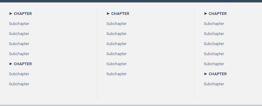
I solved this issue by having two or three chapters in some of the columns. To have them look the same as the top menu option I added som text effects. See image below.
I thought I solved it. It looks really great and I can fit the massive amount of menu options all within the mega menu. Then I resized the window and realize this looks crap on the mobile menu.
Is there any other way to solve my issue with stacking sub headings in a column in a mega menu, without sabotaging the mobile menu?
Is it possible to create a separate menu which is used in mobile mode (or browser width =< mobile resolution)?
